Subtitle Formatting Options

First of all I’d like to say thank you, because this extension is super useful, and having furigana is a great feature <3
Buuut I’d be really thankful for some customization options for the subtitles themselves. I feel like a lot could be improved on the readability aspect (at least for Japanese subtitles) if some visual customization options were added.

1. [Important] An option to keep the Japanese subtitle font as it is by default on Netflix.

Netflix’s default Japanese subtitles have an outline and line breaks for easier readability, it’s specially helpful when there’s multiple speakers (whose names are indicated through parenthesis).

With the extension, however, it can get pretty confusing. Even the characters’ thickness have variations between hiragana and kanji. That decreases readability and makes it harder for quick reading. (Comparison below)

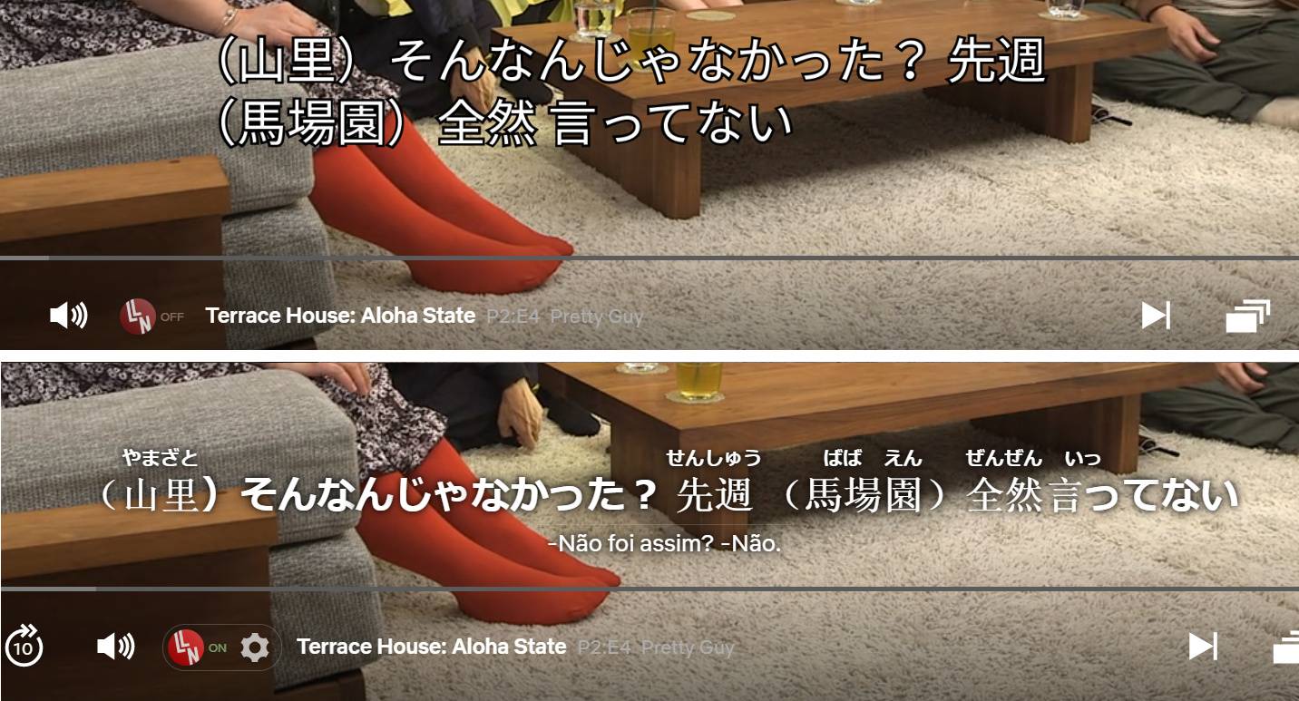
Maybe I’m a bit of a slowpoke. But it has personally led me to a lot more confused pausing than if the default font and line breaks were kept, and some times forced me to just turn off the extension.
I’m aware that it’d occupy a lot more space and that keeping things compact was probably why this decision was made, but it’d be really nice if it were optional.

2. Individual size options for subtitles. (outline / color / position could be nice too)

While using it for Japanese, I missed being able to customize the secondary subtitle size without altering the main subtitles along with it, and there was no way for me to have the secondary one bigger than the main subtitle. I could switch them up for that effect, but then I’d lose the furigana.

For the main subtitles, even the smallest font option was bigger than I’d have liked for the Japanese, so having a smaller size option would be great too.

Other options such as outline/color/position would be cool too (eg. if a person wanted one on the top of the screen and another on the bottom for some reason), but I understand that adding so many options for individual subtitles could be pretty troublesome.

3. (Pet peeve) An option to remove that little thin line between subtitles.
This one is more of a personal pet peeve, but figure I’d mention it since I’m already here, haha.

If anyone knows of any way I can modify this kind of thing on my end, even if through messing with css or config files (if anyone knows which files I need to be changing), I wouldn’t mind giving it a shot, so long as I can customize things somehow.

4 Likes

:+1: for your three points and especially #1, even though that may be not be as simple as it seems at first since I think the default subtitle rendering is done on Netflix’s servers with SVG. Essentially what LLN should do is try its best to emulate the style with CSS, which may not look exactly the same.

In the meantime for #3, as you guessed you can do it with a simple css tweak. Get an extension like Stylus and add this rule for netflix.com:

.lln-subs-separator.active {
    visibility: hidden;
}
1 Like

Here’s my quick and dirty CSS sheet in which I tried to get the original Netflix look, in case that’s of interest anyone:

:root {

  --big-outline: black 0 0 2px;
  --small-outline: black 0 0 1px;

    --sub-big-shadow:
  var(--big-outline),
  var(--big-outline),
  var(--big-outline),
  var(--big-outline),
  var(--big-outline),
  var(--big-outline),
  var(--big-outline),
  var(--big-outline),
  var(--big-outline),
  var(--big-outline),
  var(--big-outline),
  var(--big-outline),
  var(--big-outline),
  var(--big-outline),
  var(--big-outline),
  var(--big-outline),
  var(--big-outline),
  var(--big-outline),
  var(--big-outline),
  var(--big-outline),
  var(--big-outline),
  var(--big-outline),
  var(--big-outline),
  var(--big-outline),
  var(--big-outline),
  var(--big-outline),
  var(--big-outline),
  var(--big-outline)
  ;

  --sub-small-shadow:
  var(--big-outline),
  var(--big-outline),
  var(--big-outline),
  var(--big-outline),
  var(--big-outline),
  var(--small-outline),
  var(--small-outline),
  var(--small-outline),
  var(--small-outline),
  var(--small-outline),
  var(--small-outline),
  var(--small-outline),
  var(--small-outline),
  var(--small-outline),
  var(--small-outline),
  var(--small-outline),
  var(--small-outline),
  var(--small-outline),
  var(--small-outline),
  var(--small-outline),
  var(--small-outline),
  var(--small-outline),
  var(--small-outline),
  var(--small-outline),
  var(--small-outline),
  var(--small-outline),
  var(--small-outline),
  var(--small-outline)
  ;
}

#lln-main-subs {
    user-select: text;
}

#lln-subs {
    font-weight: 400;
   text-shadow: var(--sub-big-shadow);
}

.lln-word.with-translit .translit {
    text-shadow: var(--sub-small-shadow);
}

.AkiraPlayer .lln-bottom-panel .lln-whole-title-translation {
    text-shadow: var(--sub-big-shadow);
}


.lln-subs-separator.active {
    visibility: hidden;
}

Looks like this:

2 Likes

Hey, thanks for the detailed feedback, it’s appreciated. I’ll add it to the TODO list thread.

2 Likes

Wow! This was beyond my expectations :heart: I’d have been happy with some css pointers on which ids were being used for the subtitles (for some reason netflix wasn’t letting me right click to inspect on chrome) but you even did the fixes, and it looks great!
Thank you so much Lea! It worked perfectly!

I noticed it was added to the roadmap, thank you very much for the consideration and the hard work! :heart:

If it’s of use to anyone else, I have just discovered that the font netflix uses for Japanese is MS Gothic as a generic placeholder for TTS’ proportionalSansSerif. I altered the font-family on the css Lea provided and while it’s not the same as the default font, at least now there’s no more weight changes between kanji and kana. c:

(Source: Netflix’s Japanese Timed Text Style Guide)

I also bumped into this, if anyone finds it interesting:
Netflix’s Tech Blog: Implementing Japanese Subtitles on Netflix.
It’s not too useful for a regular end user, but more of a slightly off topic curiosity if anyone’s interested in seeing their inner workings. c:

2 Likes

Bumping this up. Og, take a look. @oaprograms

1 Like

@oaprograms this would be amazing!

This would be awesome! The drop-shadow it has right now makes it really hard for me to read the subtitles. I would love it if you could make it customizable so that it has a black outline rather than a dropshadow.