Hi,
Thanks for amazing phrase pump. However, this happens all the time. I checked with my wifi, i dont think its wifi problem.
Can you have a look?
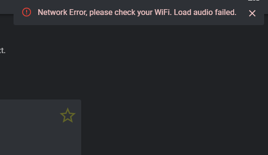
Hi,
Thanks for amazing phrase pump. However, this happens all the time. I checked with my wifi, i dont think its wifi problem.
Can you have a look?